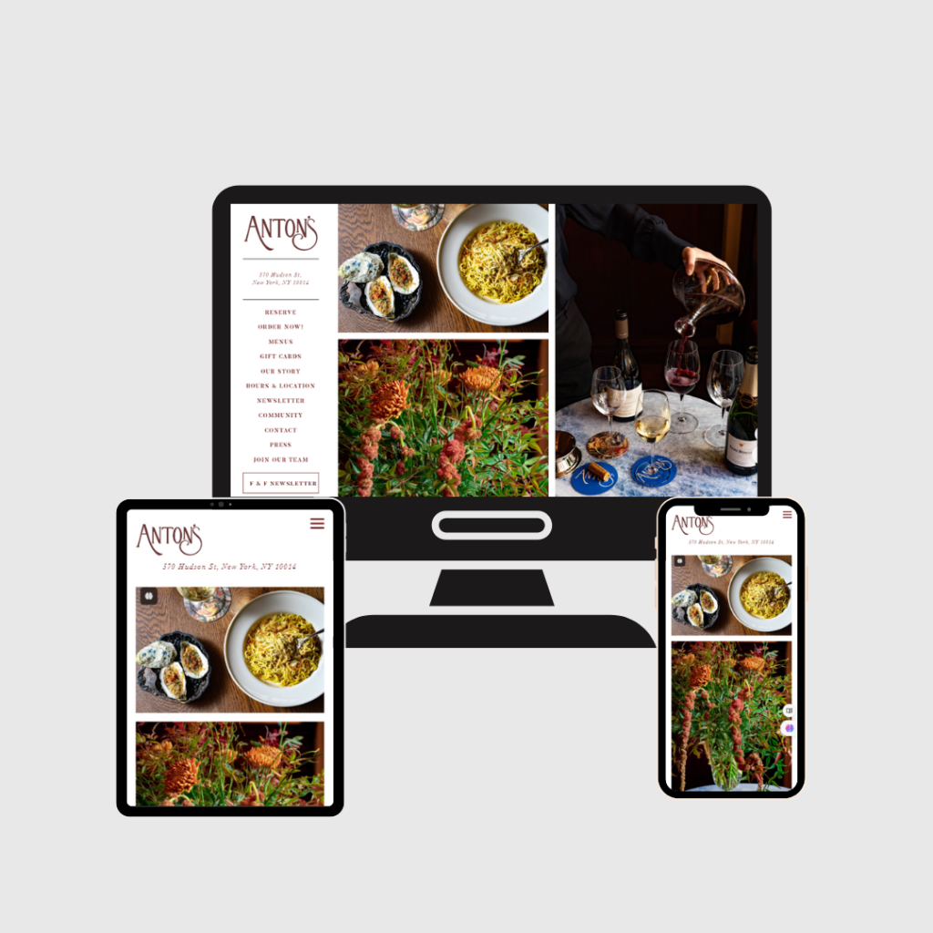
Anton’s Reastaurant Website
Background
Anton’s, a high-end restaurant located in New York, sought to revamp its online presence with a modern, user-friendly website. The primary goals were to enhance the customer experience, increase online reservations, and better reflect the restaurant’s brand and ambiance.
Challenges
- Outdated Design: The existing website was outdated, not mobile-responsive, and did not reflect the luxurious ambiance of the restaurant.
- Poor User Experience: Navigation was cumbersome, and key information such as the menu, hours of operation, and contact details were hard to find.
- Low Conversion Rate: The online reservation system was underutilized, leading to missed opportunities for bookings.
- Limited SEO: The website was not optimized for search engines, resulting in low visibility and organic traffic.
Goals
- Modernize Website Design: Create a visually appealing and user-friendly website that aligns with Anton’s brand.
- Enhance Functionality: Integrate plugins to add essential features like image galleries, client testimonials, and booking forms.
- Improve SEO: Optimize the website to improve search engine rankings and attract more organic traffic.
- Increase User Engagement: Implement features that encourage visitor interaction and conversion.
Strategy
Step 1: Research and Planning
Market Analysis
- Conducted a competitive analysis to understand the web presence of similar high-end restaurants.
- Analyzed customer feedback to identify pain points and desired features.
Audience Identification
- Defined target demographics including locals, tourists, and business professionals.
- Developed user personas to tailor the website experience to different user needs.
Step 2: Design and Development
Wireframing and Prototyping
- Created wireframes to outline the website structure and user flow.
- Developed high-fidelity prototypes to visualize the final design.
Design
- Visual Aesthetics: Designed a visually stunning website that reflects the luxurious atmosphere of the restaurant using high-quality images and elegant color schemes.
- Responsive Design: Ensured the website was fully responsive, providing an optimal viewing experience across all devices.
User Experience (UX)
- Navigation: Simplified the navigation with a clear menu structure.
- Accessibility: Incorporated accessibility features to ensure the website was usable by all visitors, including those with disabilities.
- Interactive Elements: Added interactive elements such as hover effects and animations to enhance user engagement.
Step 3: Development
Content Management System (CMS)
- Implemented WordPress as the CMS for its flexibility and ease of use.
- Developed custom templates to meet the specific needs of the restaurant.
Features and Functionality
- Online Reservation System: Integrated a seamless reservation system that allows customers to book tables directly from the website.
- Menu Display: Created a dynamic menu section that is easy to update and showcases the restaurant’s offerings with enticing descriptions and images.
- Events and Specials: Added a section for upcoming events and special offers to attract more visitors.
Step 4: Optimization and Testing
SEO Optimization
- Conducted keyword research and optimized on-page elements such as meta tags, headings, and content.
- Improved page load speed to enhance user experience and SEO rankings.
Testing
- Performed extensive testing across different devices and browsers to ensure compatibility and performance.
- Gathered feedback from a select group of users and made necessary adjustments.
Results
- Increased Traffic: Organic traffic increased by 40% within three months of the new website launch due to improved SEO and user experience.
- Higher Engagement: Average session duration increased by 25%, indicating better user engagement.
- Boost in Reservations: Online reservations saw a 50% increase, demonstrating the effectiveness of the new booking system.
- Positive Feedback: Received positive feedback from customers appreciating the modern look and ease of use of the new website.

